React Native Horizontal List
Horizontal list can be achieved by using the component ScrollView with setting the horizontal attribute to true and placing the views mapping the array data within the component.
The example here illustrates the list of images portrayed horizontally that can be scrolled and selected.
Example of Horizontal List
Create array list or fetch the list with the data to be displayed
This file contains bidirectional Unicode text that may be interpreted or compiled differently than what appears below. To review, open the file in an editor that reveals hidden Unicode characters.
Learn more about bidirectional Unicode characters
const slides = [ | |
{ | |
uri: 'https://i.ibb.co/dLqBk4W/boy1.png', | |
}, | |
{ | |
uri: 'https://i.ibb.co/12RNfL1/girl.png', | |
}, | |
{ | |
uri: 'https://i.ibb.co/myCXSqx/by2.png', | |
}, | |
{ | |
uri: 'https://i.ibb.co/kQSS6fh/grl2.png', | |
}, | |
{ | |
uri: 'https://i.ibb.co/ncJgPw3/by3.png', | |
}, | |
{ | |
uri: 'https://i.ibb.co/QjRSV7t/grl3.png', | |
}, | |
]; | |
global.slides = slides; |
Create horizontal list mapping the data
This file contains bidirectional Unicode text that may be interpreted or compiled differently than what appears below. To review, open the file in an editor that reveals hidden Unicode characters.
Learn more about bidirectional Unicode characters
function App() { | |
const [avatarurl, setSelectedIm] = useState(null) | |
const slides = [ | |
{ | |
uri: 'https://i.ibb.co/dLqBk4W/boy1.png', | |
backgroundColor: '#20d2bb', | |
}, | |
{ | |
uri: 'https://i.ibb.co/12RNfL1/girl.png', | |
backgroundColor: '#febe29', | |
}, | |
{ | |
uri: 'https://i.ibb.co/myCXSqx/by2.png', | |
backgroundColor: '#22bcb5', | |
}, | |
{ | |
uri: 'https://i.ibb.co/kQSS6fh/grl2.png', | |
backgroundColor: '#3395ff', | |
}, | |
{ | |
uri: 'https://i.ibb.co/ncJgPw3/by3.png', | |
backgroundColor: '#f6437b', | |
}, | |
{ | |
uri: 'https://i.ibb.co/QjRSV7t/grl3.png', | |
backgroundColor: '#febe29', | |
}, | |
]; | |
global.slides = slides; | |
updateSelData = () => { | |
if (avatarurl != null) { | |
alert('Image Selected') | |
}else{ | |
alert('Please select a image') | |
} | |
} | |
return ( | |
<ImageBackground | |
source={require('./image/bg_signup.jpg')} | |
style={styles.container}> | |
<Text style={{ alignSelf: "center", color: "white", fontSize: 25 }}>Horizontal Images</Text> | |
<StatusBar | |
backgroundColor="#041E2F"/> | |
<SafeAreaView | |
style={styles.container} | |
contentContainerStyle={{ flex: 1, justifyContent: "center" }} > | |
<ScrollView | |
contentInsetAdjustmentBehavior="automatic" | |
contentContainerStyle={{ flex: 1, justifyContent: "flex-start" }}> | |
<View style={styles.containerInput}> | |
<View> | |
<Card | |
containerStyle={{ backgroundColor: "translucent",padding: 10, marginLeft: 0, marginRight: 0, marginTop: 0, }}> | |
<View | |
style={{ flexDirection: 'row', justifyContent: 'space-between' }}> | |
<Text style={{ color: '#228B22' }} > | |
Choose profile image </Text> | |
</View> | |
<View style={{ marginTop: 10, flexDirection: 'row', width: '100%' }}> | |
<ScrollView | |
horizontal={true} | |
showsHorizontalScrollIndicator={false}> | |
{ | |
global.slides.map((item, key) => ( | |
<View style={{ margin: 5 }} key={key}> | |
<TouchableHighlight onPress={() => { setSelectedIm(item.uri) }}> | |
<Image | |
source={{ | |
uri: item.uri, | |
}} | |
style={{ width: 70, height: 70, margin: 10 }} | |
/> | |
</TouchableHighlight> | |
<View | |
style={{ | |
flexDirection: 'row', | |
justifyContent: 'space-between', | |
}}> | |
</View> | |
<View | |
style={{ | |
flexDirection: 'row', | |
justifyContent: 'space-between', | |
}}> | |
</View> | |
</View> | |
))} | |
</ScrollView> | |
</View> | |
</Card> | |
</View> | |
<TouchableOpacity style={styles.loginBtn}> | |
<Text onPress={updateSelData} style={styles.textStyle}>Submit</Text> | |
</TouchableOpacity> | |
</View> | |
</ScrollView> | |
</SafeAreaView> | |
</ImageBackground> | |
); | |
} | |
export default App; |
In order to select the image use TouchableHighlight and onpress store the selected image/data by using state in class or useState in function component. The validation can be checked on press of submit button.
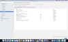
Outcome:
Find the complete code here
Stay tuned to my posts and do share your valuable thoughts if any queries or you would like to share anything on this topic in the comment section and please do like and share my post if this was helpful.
Hope you liked it :)
0 Comments